This week, has been all about neutral fabrics.
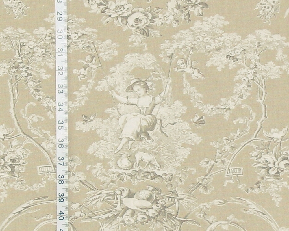
This has been a surprise for us,
usually in the summer people are ramping up the use of color.
But, not this year.
Neutral fabrics are HOT!
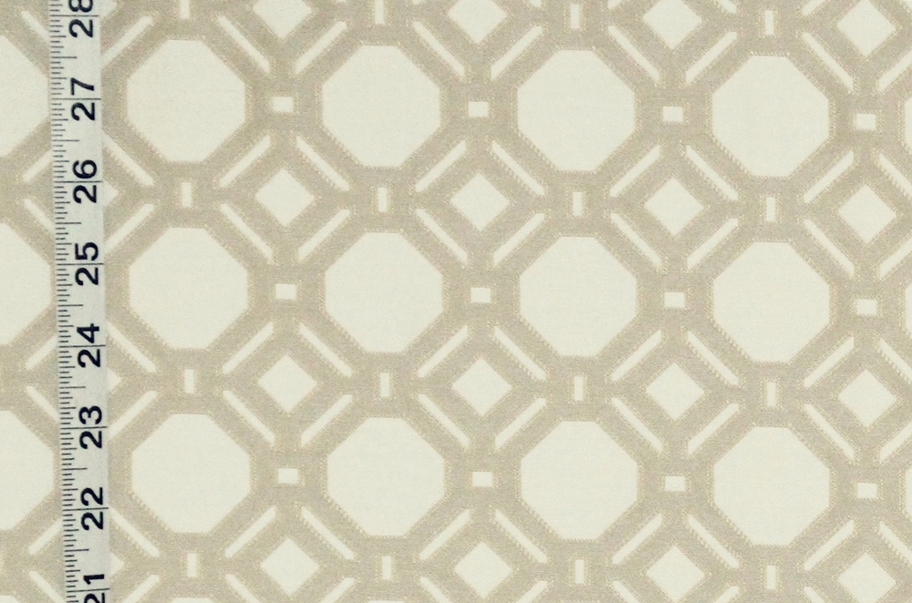
For geometrics there are two different lattice patterns.
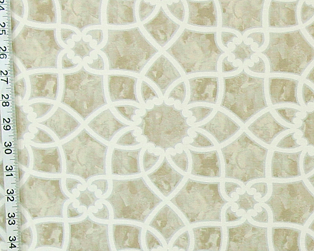
One is a print,
and one is a woven upholstery fabric.
Both are available in a brown or tan color and in grey.
For those looking for a shell fabric,
there are quite a lot of them to choose from.
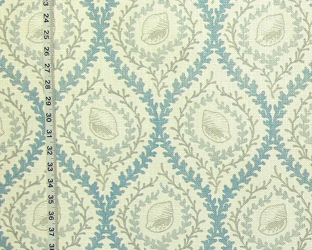
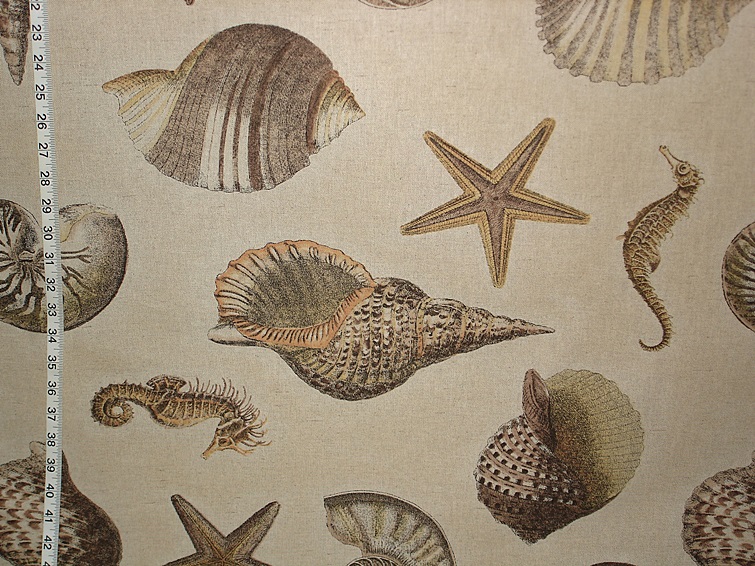
The seashell seahorse fabric
is an over-sized pattern with touches of soft orange.
For coral there is the brown coral fabric,
with grey sea fans.
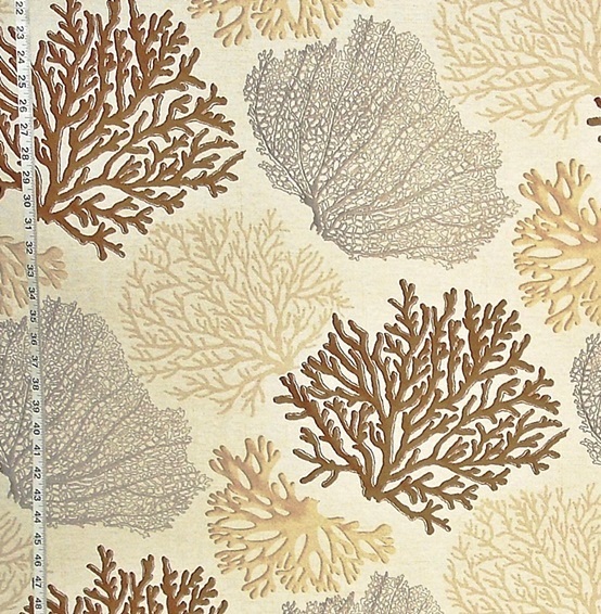
This is another large pattern done in
brown, beige, and grey.
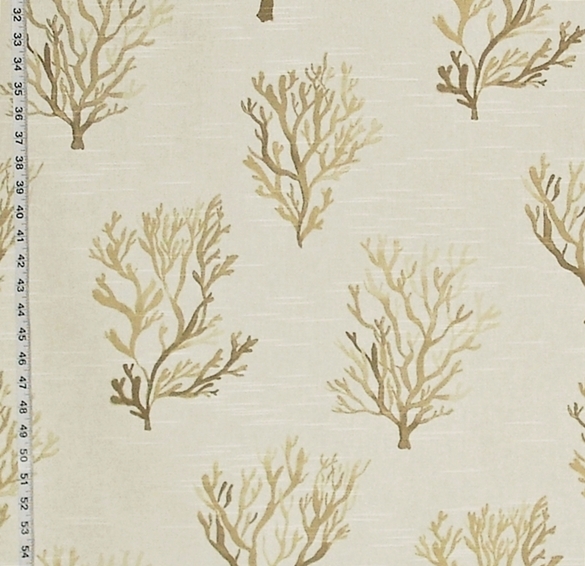
Another brown coral fabric has a watercolor look.
Many of the neutral fabrics have a bit of color added
to the pattern for emphasis.
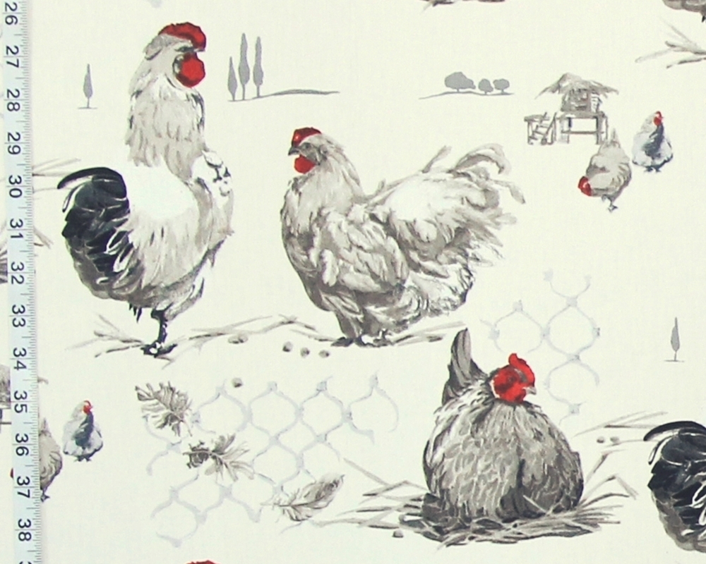
The French chicken toile is an example.
Done in neutral tones,
the added red gives a color to the pattern,
but also mentally gives us a key for design,
as it is used on the cockscombs.
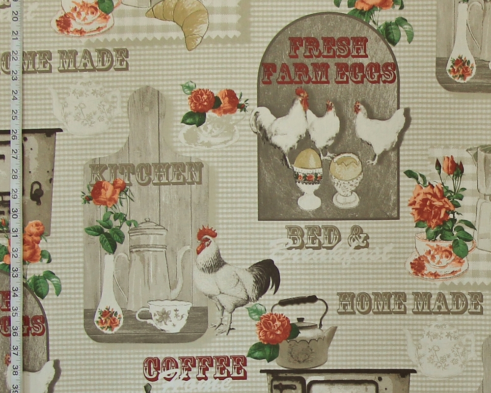
What we call the breakfast chicken fabric has
a neutral color palette with orange for a nice contrast.
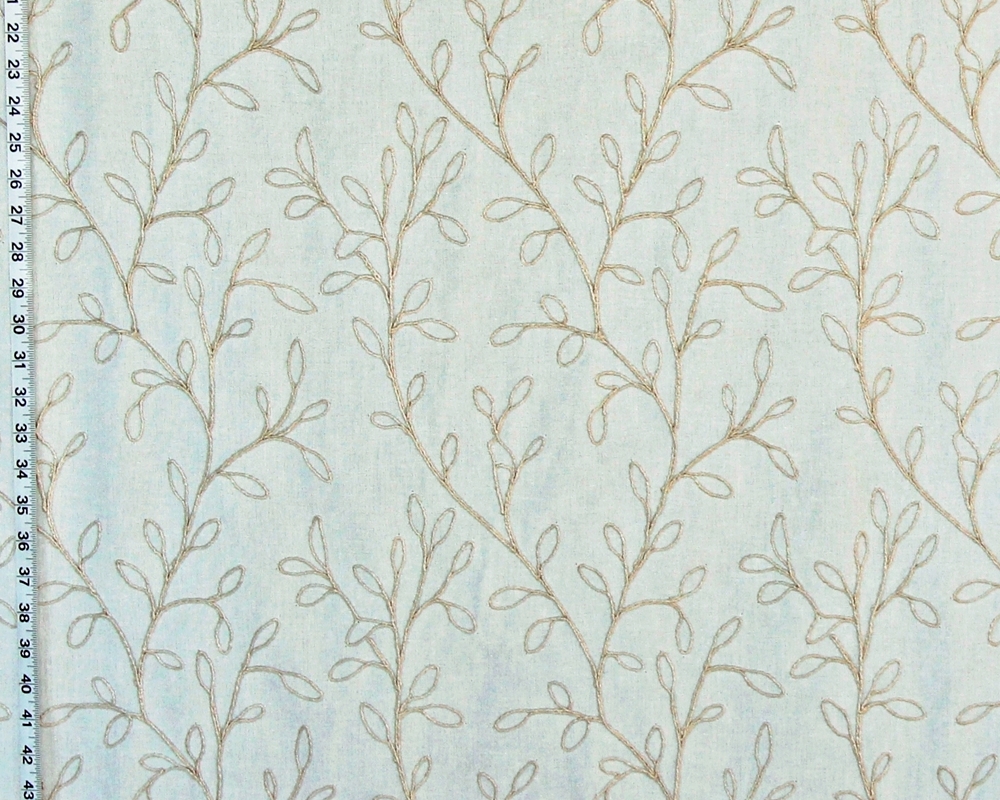
There are two leaf patterns that are neutrals.
One has burlap colored leaves on white.
It has a relaxed boho feel to it.
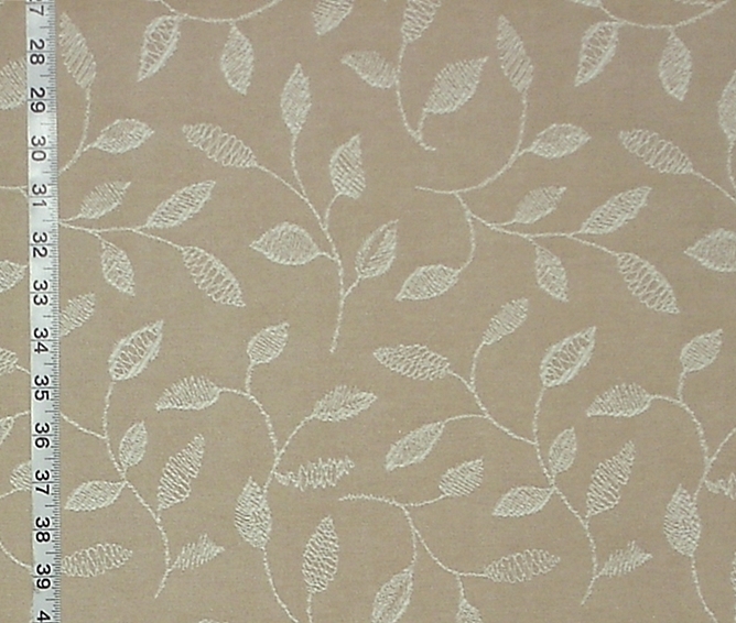
The other is almost the opposite in color, look, and feel.
The feeling of this is crisp.
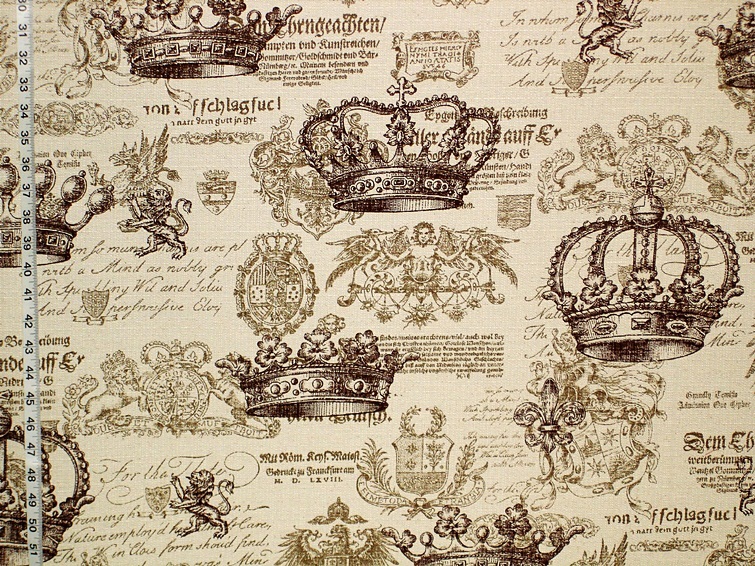
There are two medieval patterns done in neutrals.
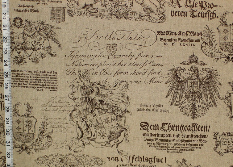
The Medieval Crown fabric is done on off-white.
What I like about neutrals is they are versatile.
First the decision has to be made- warm or color tones?
Take brown. Brown is a combination of red, yellow, and blue. Does it have a warm look- with more yellow and red? Or is it a cool brown, with more blue? Does a grey move to a yellow or to blue? If one is not sure, take a yellow or blue color chart, and hold it next to the fabric and see… does it seem more yellow? Or does it move to blue? These are thoughts that will help you as you move through the process of decorating.
Remember, decorating is for YOU! It is about what you like, what you wish to live with. There is no right or wrong, it comes down to what makes one happy when one looks at your room.
Okay, so neutrals are versatile. We have that. Now, what are you going to do with it? Do you want to punch it up with color? Use a design that is in high contrast?
My favorite neutral is the Clarence House Fabric Sabartes.
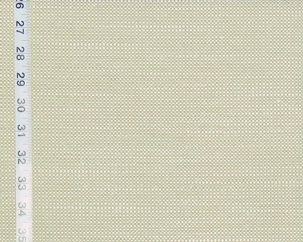
This is a woven of taupe and white, with
a very, very thin thread of light off white grey.
This can appear warm or cool,
depending on what is around it.
It is that neutral.
And against this,
one can put just about anything.
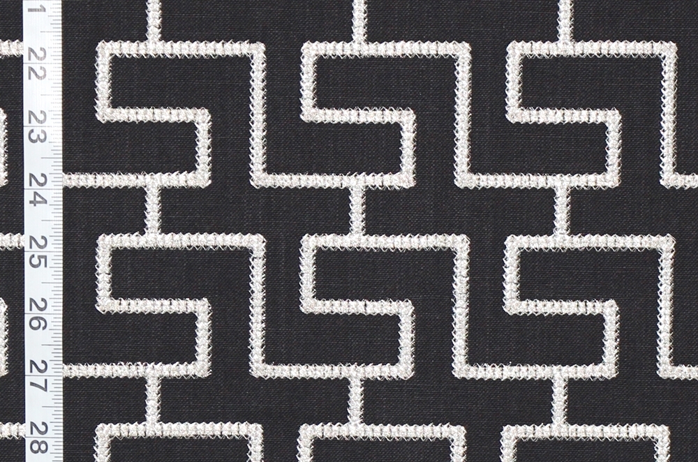
Want a modern pop?
Try the modern Greek key in black.
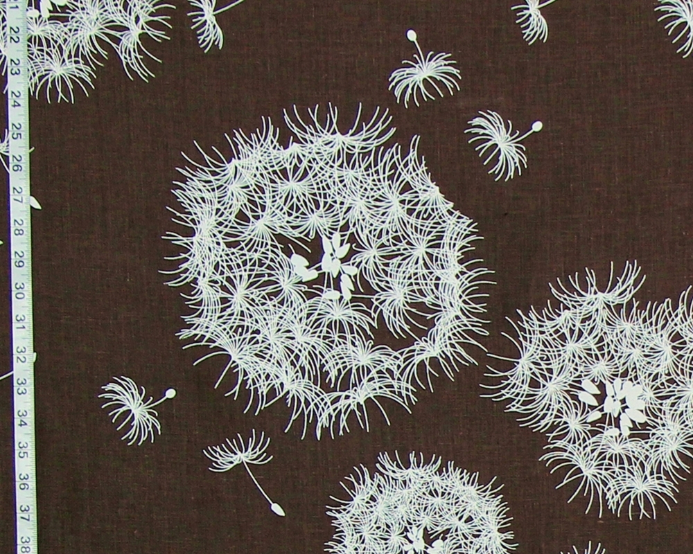
Or try the brown dandelion fabric.
If you don’t want a high contrast color,
try a contrasting pattern-
either of the lattice patterns above would give a
nice contrast while staying in the same color range.
Or if you want a subtle color added
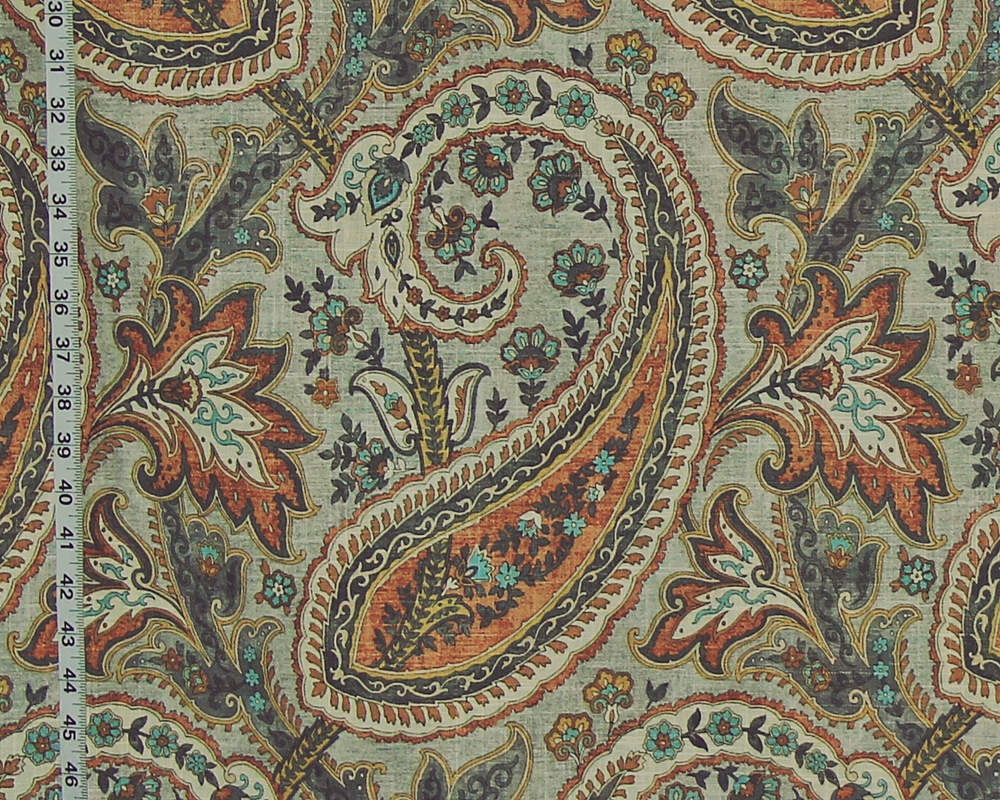
the large orange paisley fabric would make a warm contrast.
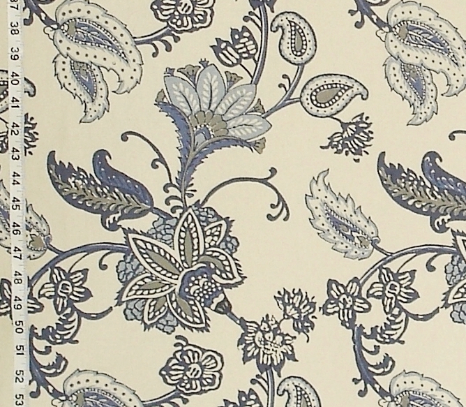
The blue paisley handprint would make a cool contrast.
With neutrals, the decorating choices are wide open. Do you want calm? Or do you want jazz? The choice is yours, and you can get what you want by considering color, pattern, scale, and placement in a room. So, go have fun with it!
Take a look at some of the different neutral fabrics
and see if there is anything you can work with
for a change in your decorating scheme.
See the
_______________________________
